
- Home
- Responsive Design
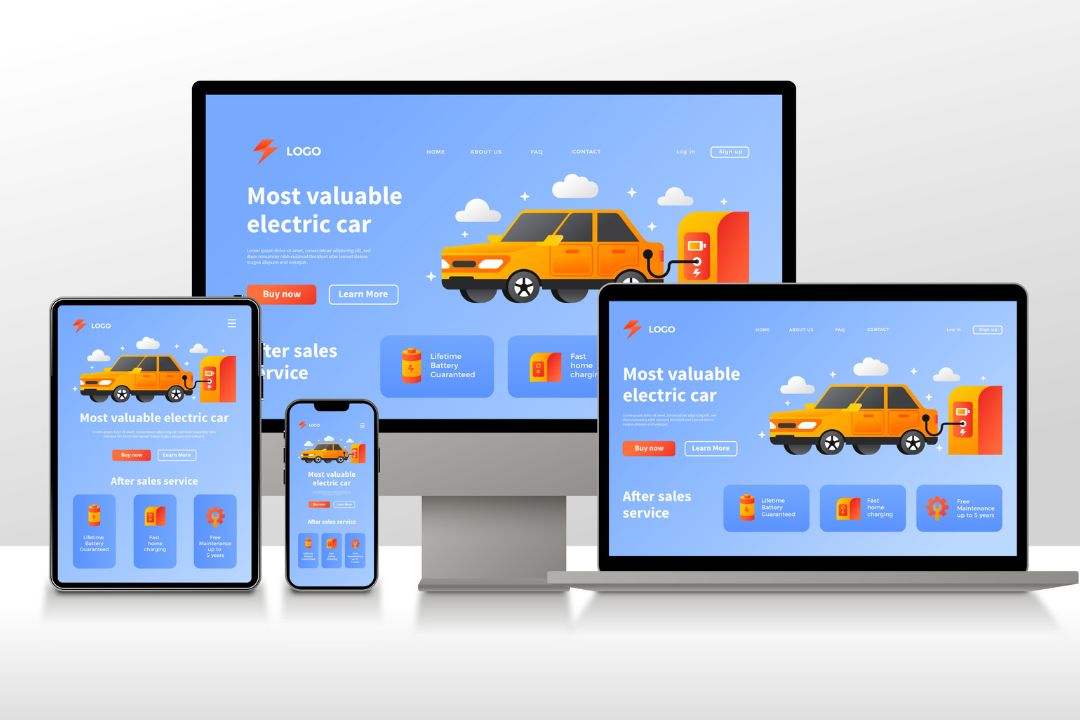
Key Features of a Responsive WordPress Website:
-
Flexible Layouts: The design uses relative units (like percentages) instead of fixed units (like pixels), allowing content to resize dynamically.
-
Media Queries: CSS media queries detect the device type and apply different styling rules to optimize the display for each screen size.
-
Mobile-First Design: Many responsive WordPress themes prioritize mobile users by designing for smaller screens first and scaling up for larger ones.
-
Image Scaling: Images automatically resize and adjust their resolution based on the user’s screen to ensure fast loading and proper display.
-
Navigation Adaptation: Menus typically collapse into mobile-friendly formats (like hamburger menus) on smaller devices.
-
Touch-Friendly Elements: Buttons, links, and forms are optimized for finger taps rather than mouse clicks on mobile devices.
-
Theme Support: Most modern WordPress themes (especially those from the official theme directory or premium providers like Astra, Divi, or OceanWP) come with built-in responsive design.
-
Plugin Compatibility: Good responsive design ensures that plugins (like sliders, contact forms, or pop-ups) also display correctly on all devices.
A responsive design in a WordPress website refers to the website's ability to automatically adjust its layout, content, and functionality to look and perform well across various devices and screen sizes—including desktops, tablets, and smartphones.
Transforming Ideas into Beautiful Designs
Contact us today for a free consultation or quote.